The Making of the Spring/Summer 2023 Lookbook
Our Spring/Summer 2023 Lookbook has arrived, and we’re pulling back the curtain to reveal CreativeMC’s extensive process behind the curation and selection of the latest seasonal trends and branded promotional products. From market research, trend analysis, and concept design to styling, photography, and designing the pages of the lookbook, our blog will give you a never-before-seen look at the secret sauce that produces our unique point of view on corporate swag styles that our clients anticipate and appreciate each season.
Fashion, Design, and Other Inspiration
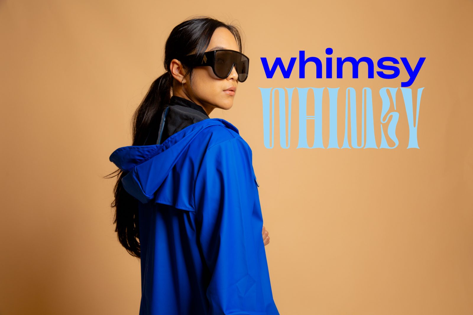
Our process began with curating the intersections of trends in fashion, graphic design, interior design, colors, and promotional products to create a seasonal mood board. We reviewed the spring/summer fashion shows from New York, London, Milan, Tokyo, and Paris for new trends in colors, materials, and styles. Cobalt blue was a huge force on the runway, for example, which is reflected in one of our four color palettes.
In graphic design, pop art letters and handwriting-like lettering were popular, while interior design magazines showcased the pervasive use of color-blocking earthy neutral colors. Pantone trends and Spring/Summer colors from paint companies provided insight into the season's most popular hues.
Finally, we connected with our top corporate swag vendors and retail brand partners large and small for new product releases, colorways, and materials. Since our clients increasingly prioritize sustainability and social impact, 62% of the items we selected for the lookbook support underrepresented communities, social causes, and/or the Earth.
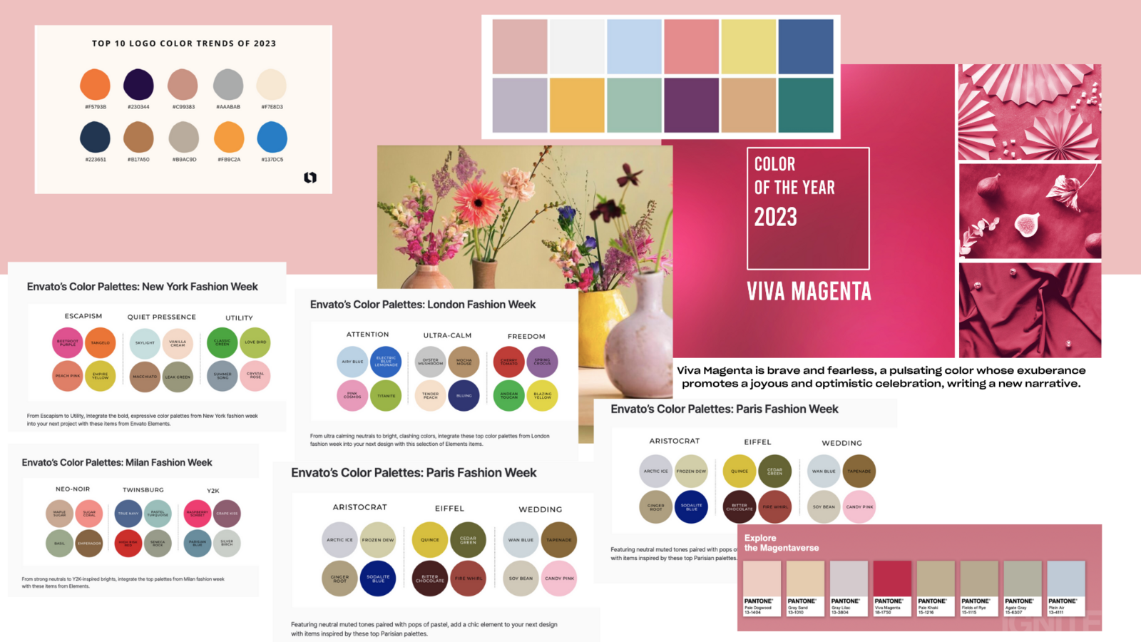
Compiling the mood board is where the creative magic begins! We layer into our process the exploration of societal and corporate culture trends to ensure our trends feel very “now.” Our goal is to identify the emotional underpinning of the trends and reflect the mood of the world, which in turn impacts what products will feel most relevant to clients.
With marketing and creative teams spanning the U.S. and Czechia, a Czech graphic designer, and American photographer engaged in the project, the CreativeMC brand ethos of multicultural collaboration is truly present at every step of our process.”
From the mood board, our seasonal concept Confidence X Rejuvenation was born, with four distinctive looks that highlight different dimensions of the theme. In the aftermath of the COVID era, people are seeking broader, more enriching experiences to develop a more revived and optimistic persona, which is often associated with spring. In terms of color, this translated to three earthy neutrals punctuated by a neon or bright statement color for each of the four looks, capturing the duality of personal zen with a punch of confidence and exuberance.
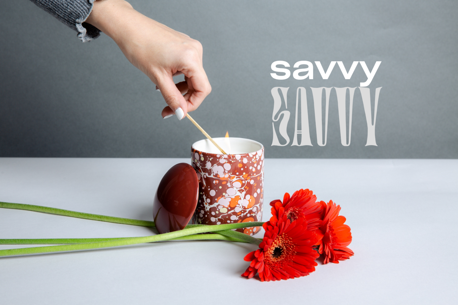
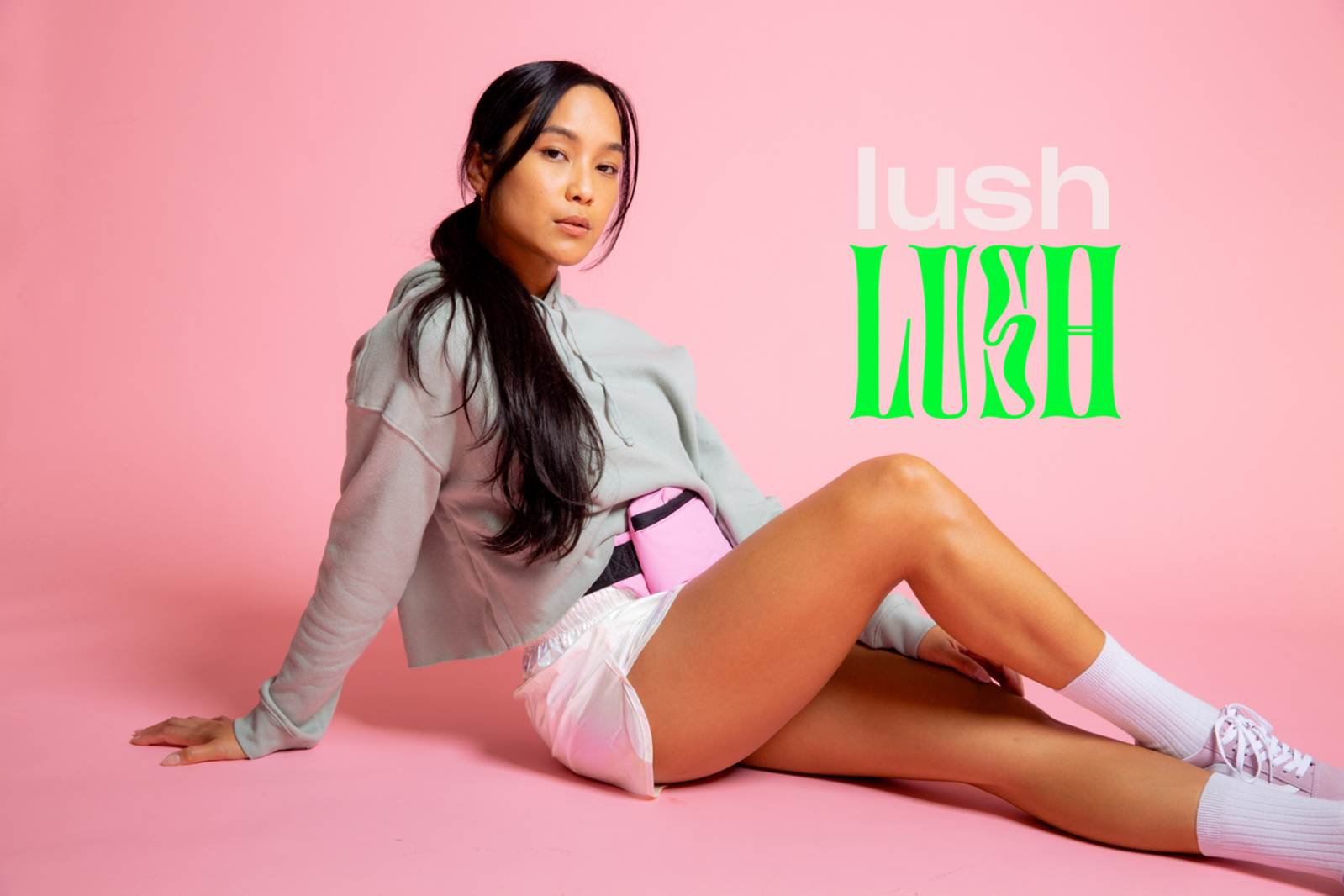
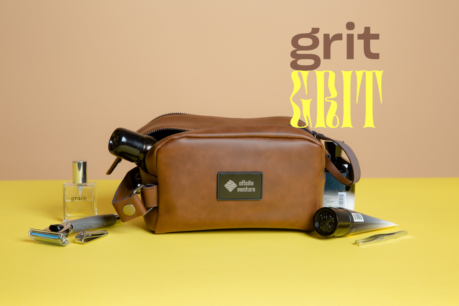
The trend names developed for each – Savvy, Lush, Grit, and Whimsy – not only embody the energy of each look but also express different dimensions of confident rejuvenation.
Photography look and feel
Photographer Jonah Reenders also worked closely with Patton to discuss the thematic words, energy, and colors they wanted to embody with the imagery. Early on, the team decided to cast four multicultural models – three female, one male – reflecting the diversity of CreativeMC’s team and home city of San Francisco, as well as our commitment to featuring minority-owned brands.
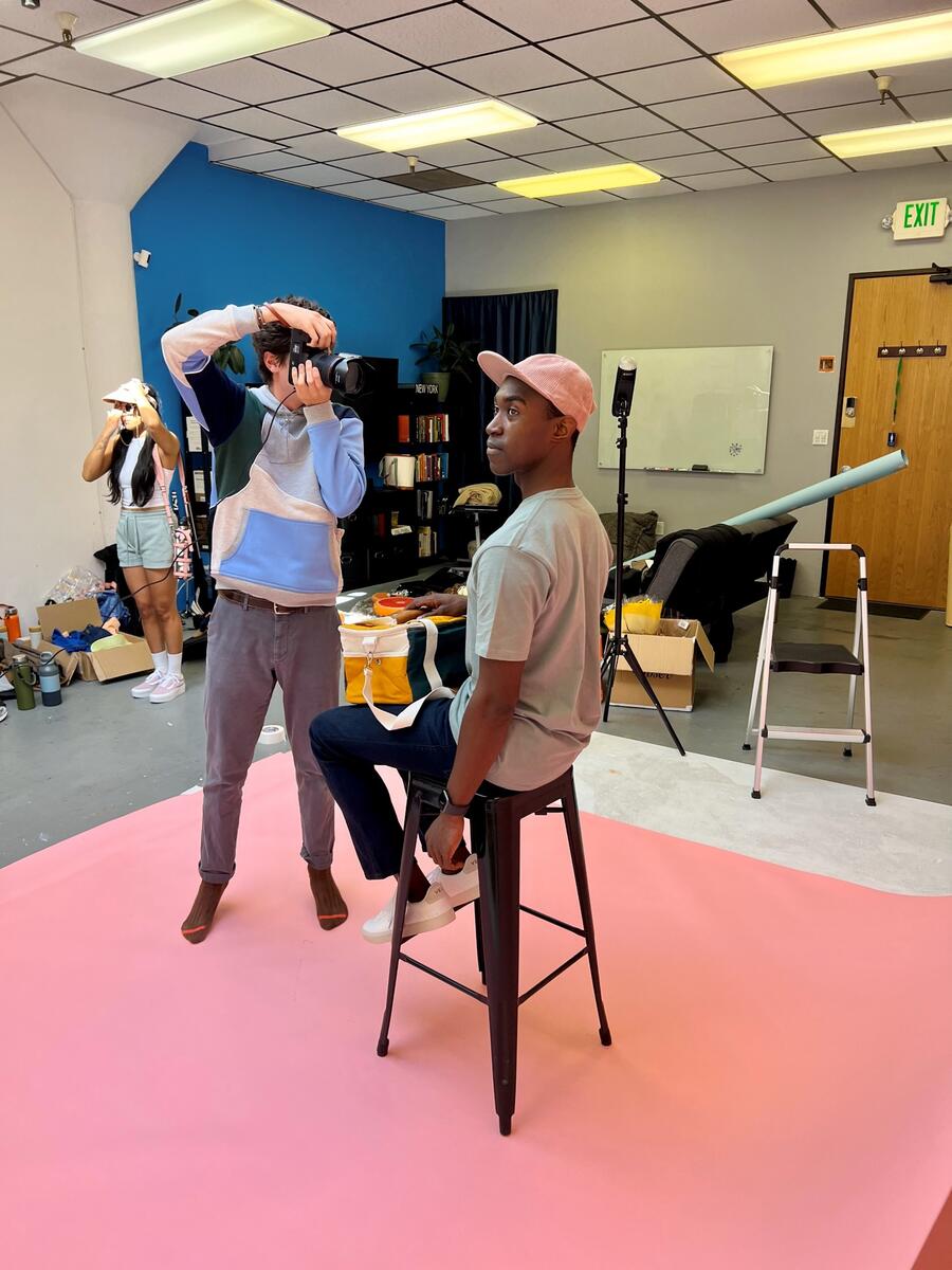
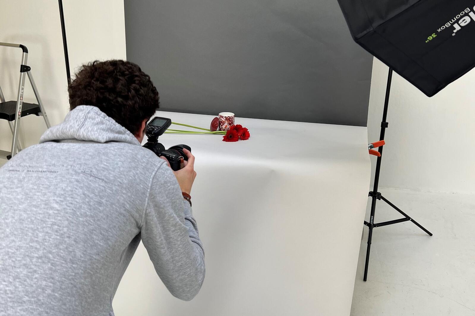
Given the significant role of color in the looks, Reenders decided to spend two of three days of the shoot in a studio for the first time to focus on the models, accessories, and clothing. He tapped into not only the bright colors but also the energy of the individuals.
I wanted the photography to be alive and energetic with our models having a lot of playful energy and movement. I encouraged the models to try everything.”
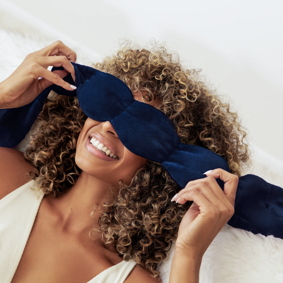
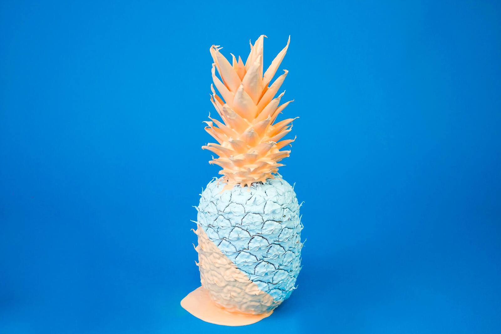
The studio also allowed for more freedom and play, including techniques like strobe lighting for a more commercial look. Accessories including flowers, sunglasses, and fruit were added to celebrate the spring and summer seasons and bring static products to life.
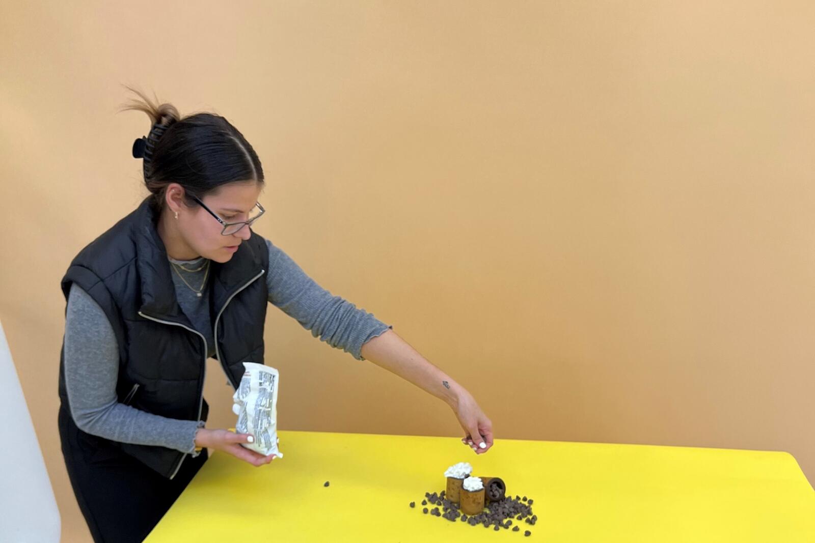
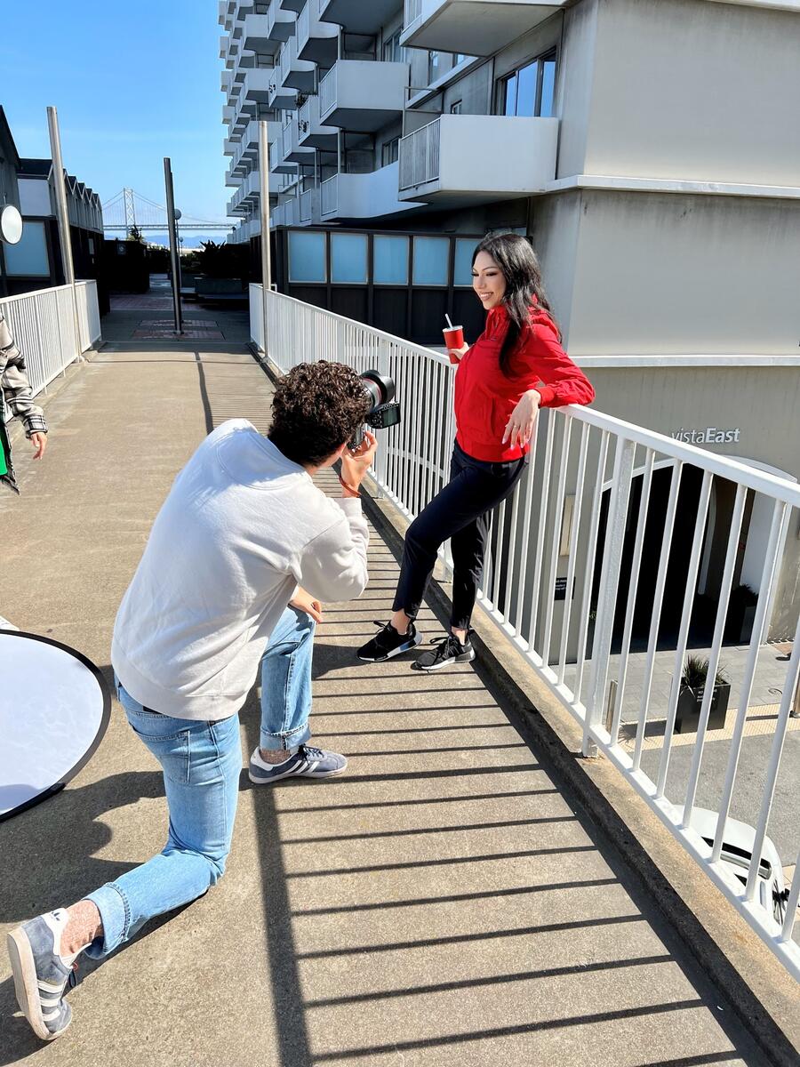
Outside the studio, Reenders chose to shoot in Jackson Square, with the architecture and natural surroundings allowing him to incorporate the browns and blacks of the grit trend and the greys and whites of the savvy trend.
“For the CreativeMC brand, it’s important to find the balance between high-fashion photography and how we need to showcase the products for clients. I know what makes a CreativeMC shot, but I also know where we can afford to push our boundaries and take risks,” said Reenders.
Styling the shots
With the trends defined, our stylist, Abby Young, reviewed each of the looks and the featured garment or promotional product CreativeMC was showcasing, then determined what was needed to supplement the piece to create a completed outfit for the photoshoot.
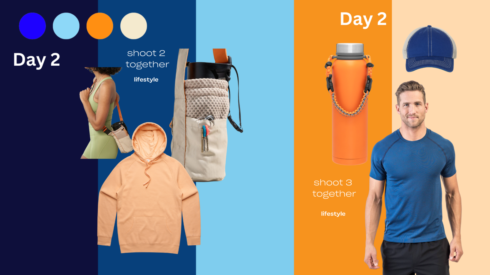
The target audience was also an important factor in Abby’s style choices: professionals in their late 20s to 30s who live in trendsetting urban areas. That meant embodying a cross-section of professional styles, from the eclectic Northern California and casual chic Southern California looks to more classic business fashion on the East Coast to artsy Austin and trend-focused Miami. We wanted the styling to accentuate the trends while pushing for a more aspirational edge.
In the psychology of colors, earth tones like browns and greens reflect stability, relatability, and reliability so having them mixed with neon colors that reflect happiness, excitement, and positivity is the perfect embodiment of confidence meets rejuvenation.”
Young then shopped for pieces that matched the desired hues, as well as clothing that matched the theme or the vibe of the trend. She hunted for wide-legged jeans, high waists, and skinny jeans, which are back in style; fanny packs worn as cross-body bags; and slim or tailed jeans and V-necks for men. Young also chose which models wore each outfit, utilizing her certification in color analysis to determine which pieces would work with which model based on skin tone and coloring.
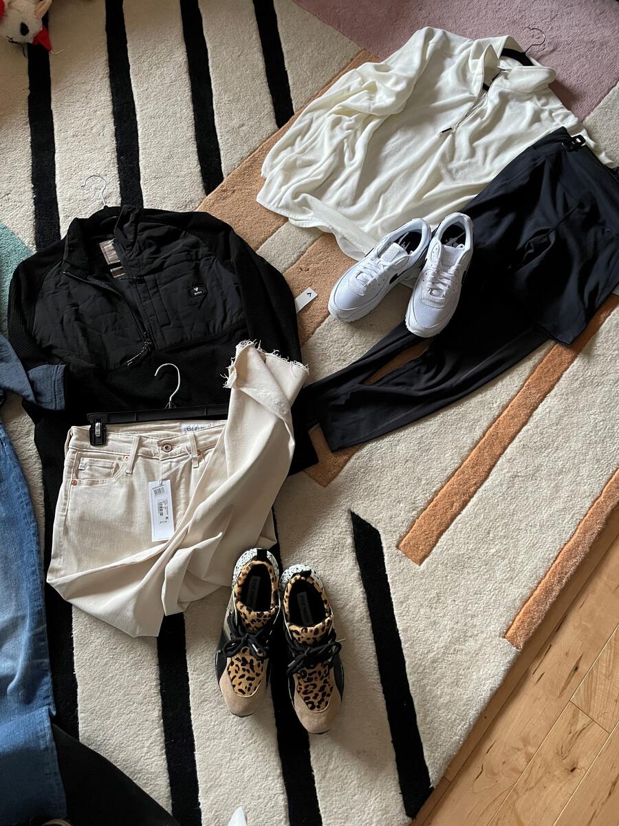
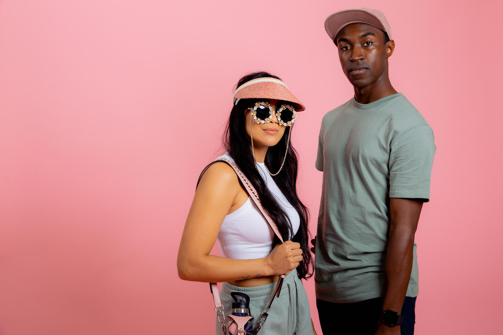
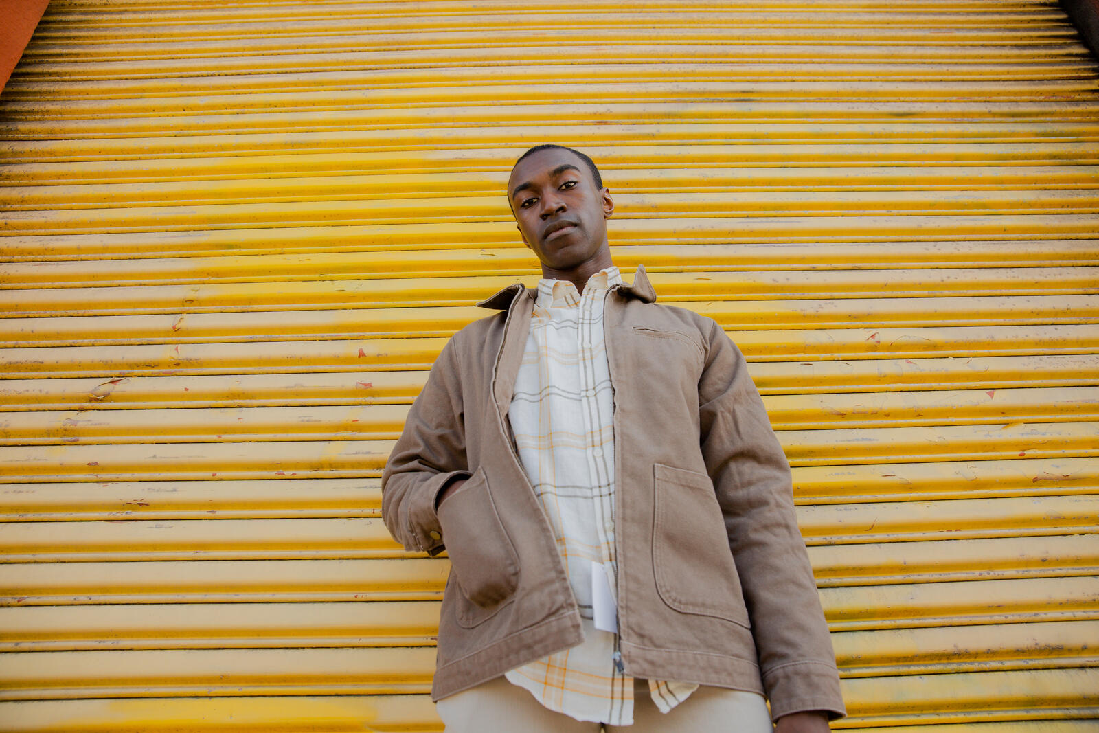
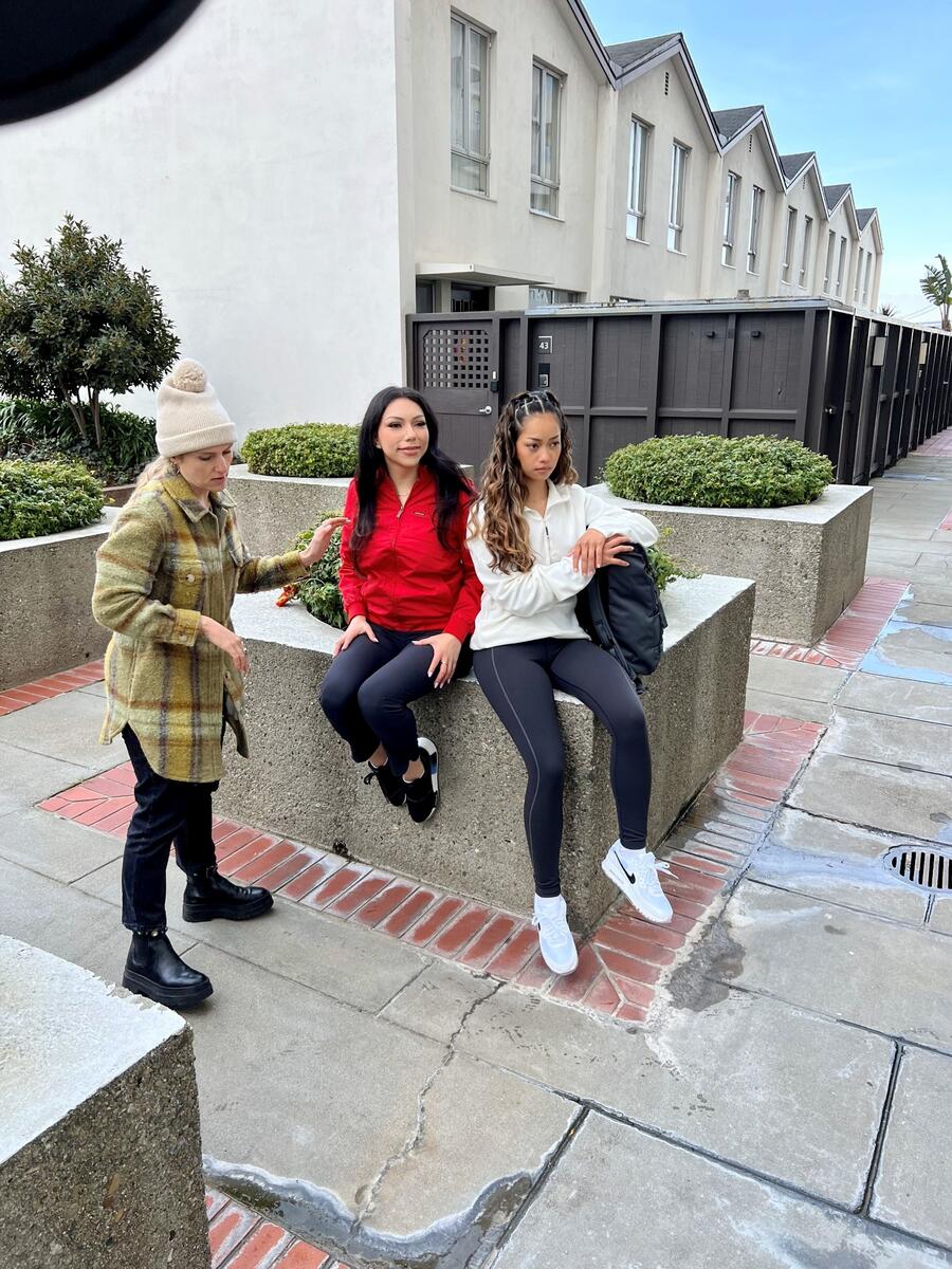
On the day of the photoshoot, she prepped the items and steamed the clothes. Throughout the photoshoot, she envisioned what concept was next and worked closely with the photographer to consider the backdrops, which looks could be shot together, and which ones were strong enough to stand on their own.
“As a stylist, it’s critical that I execute the vision of the client, so keeping the vision top of mind and visually present allows me to accomplish the overall theme of Confidence Meets Rejuvenation.” Abby Young, Stylist
Designing the pages
In the final step of the process – creating the lookbook – our art director based in Czechia, Matej Suhajek, was tasked with cohesively expressing the conclusions from the market research, the four trends, and the photography through graphic design exemplifying the moods and the overall concept.
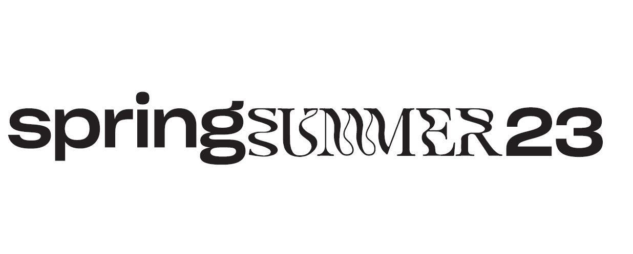
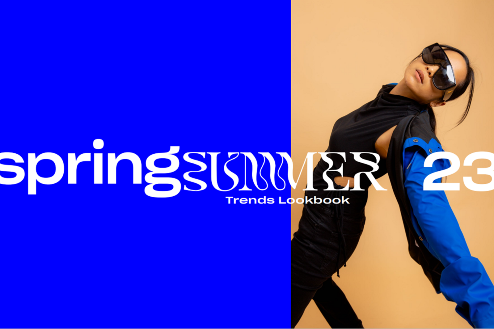
With confidence as part of the main theme and the current trends of experimental fonts and visualizing movement in design, the playful cover and headline font I chose were inspired by pop art."
The layouts reflected organic structuralism, where more space between swag images achieved an airy vibe and complemented the soft background. He focused on product images and models with products in bigger spaces, accompanied by smaller mood photography.



When it all came together – the color palettes, promotional product choices, photography, styling, and graphic design – we wanted it to have the high-end feel of a glossy fashion magazine. We believe that inspiring our clients to select swag that showcases the more aspirational qualities of their brands will make them memorable and amplify their ultimate impact.
Take a deep dive into our trends: Savvy. Grit. Whimsy. Lush.
SUMMARY
To create the Confidence X Rejuvenation-themed lookbook for Spring/Summer 2023, we embarked on the following journey:
- Conducted market analysis: We researched fashion runways and magazines, seasonal trends from interior and graphic design, and new products from our brand partners.
- Created the look and feel: Photographer Jonah Reenders designed a look that would highlight vibrant colors and capture playful energy and movement authentic to the models. Accessories like flowers and fruits accentuated the spring/summer vibe.
- Styled the trends: Our stylist, Abby Young, then purchased the apparel and accessories to flesh out the looks for each of our featured items. She prioritized looks that would appeal to CreativeMC’s target market: 20s and 30s urban professionals.
- Designed the pages: Art Director Matej Suhajek brought everything to life through the visual representation of the theme and trends. He chose a primary font inspired by pop art and graphic design style that incorporated airy space between product images.
